Data quality in most large organizations is commonly known to be rather lacking. Most would argue that things haven’t gotten much better since this 2007 Accenture study found that “Managers Say the Majority of Information Obtained for Their Work Is Useless”. To some, quotes like that are shocking, but if you think about how information is processed in most Fortune 1000 sized organizations it is surprising that data available to managers is as good as it is. These slides have been useful in my efforts to explain the persistence of data quality problems in large organizations.
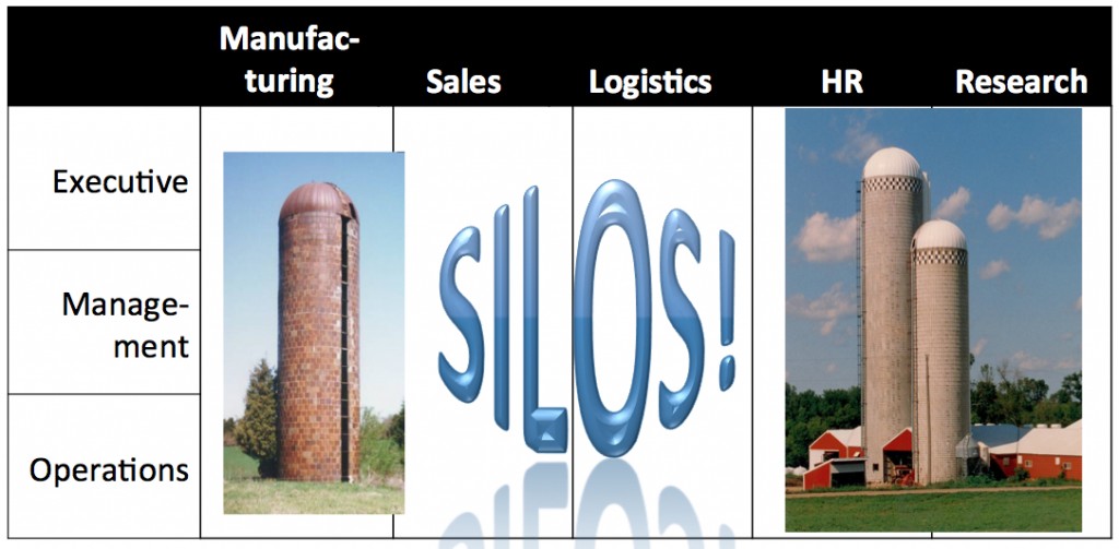
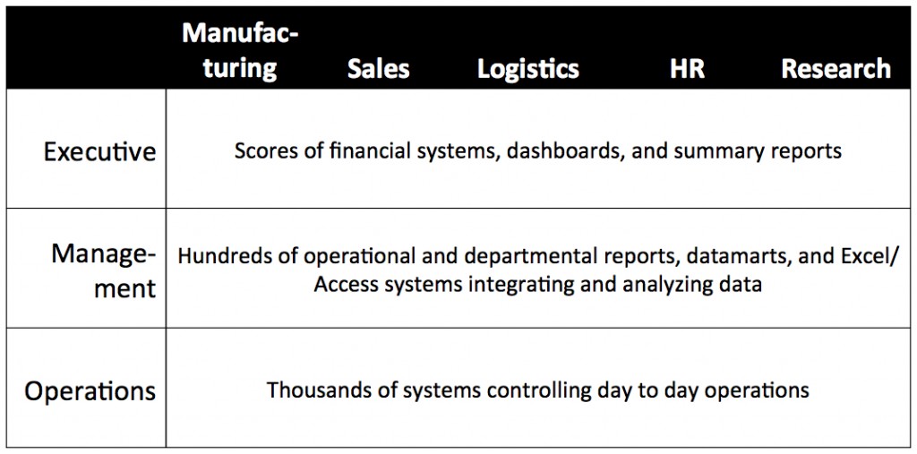
In the first picture we see the traditional layers of an organization. The Operations layer consists of the systems and processes that do day to day work, usually narrowly focused on a single process, like payroll or shipping for example, and individual objects and events, like paychecks or packages. The Management layer observes the workings of operational processes and coordinates them with each other, and hence typically supports a large number of reports, spreadsheets, and datamarts that provide information on operational processes. Finally, the Executive layer aggregates data collected from Management, summarizing process detail contained in Management reporting to understand overall status, trends, and outliers that might indicate specific risks or issues.

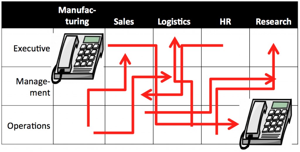
- A manager in logistics has a spreadsheet that integrates HR data with stats from a logistics application for a staff productivity report, then passes that data on to the manufacturing department for integration into their planning spreadsheet
- A detail-oriented sales exec integrates data from manufacturing, sales, and market research to produce his own customized long term forecasts
- A new operational datamart that generates planning metrics. Adoption of reports and metrics from the new datamart has been slow because they conflict with the existing logistics and sales metrics
I like these pictures because they encourage thinking about data quality this way:
- The data quality challenge is fundamentally a business problem related to use and communication of information around the organization
- The data quality challenge is very complex: it is easy to see that if a real organization were rendered into a two-dimensional grid there would be many more than 15 cells and seven data flows.
- High level strategies and conceptual data models will have little effect unless they are linked to plans clearly relevant to management of data within each cell.
Finally, unity among executives as to valid versus invalid metrics and summaries, along with setting best practices for data sharing within the organization, can create conditions in which data quality steadily improves as compliant data sharing steadily replaces entrenched ad hoc methods.

